
The shift away from flat icons
Mobile UI has been stuck in a flat design loop for years. Simple outlines and minimalist shapes were great for small screens, but they've become boring. When every game uses the same thin-line aesthetic, nothing stands out. Players are tired of seeing the same generic icons in their app drawers.
The influence of major titles is hard to ignore. Games like Genshin Impact and Honkai: Star Rail demonstrate a willingness to embrace more detailed and visually arresting interfaces. These games aren't afraid of complexity, and their success is shaping player expectations. Players are now seeking a greater sense of visual fidelity and immersive design in their mobile experiences.
We're observing a shift away from purely functional icons toward ones that contribute to the overall aesthetic experience. This doesn't mean abandoning usability, but rather integrating icon design more seamlessly into the game's art style. The goal is to create a cohesive visual language that enhances the player’s engagement. A simple outline just doesn’t cut it anymore for many players.
This baseline shift is driven by increased processing power on mobile devices, allowing for more complex visuals. It’s also a response to a saturated market, where standing out visually from the competition is more important than ever. Developers are realizing that a polished UI, complete with thoughtfully designed icons, can be a significant differentiator.
Neobrutalism and raw design
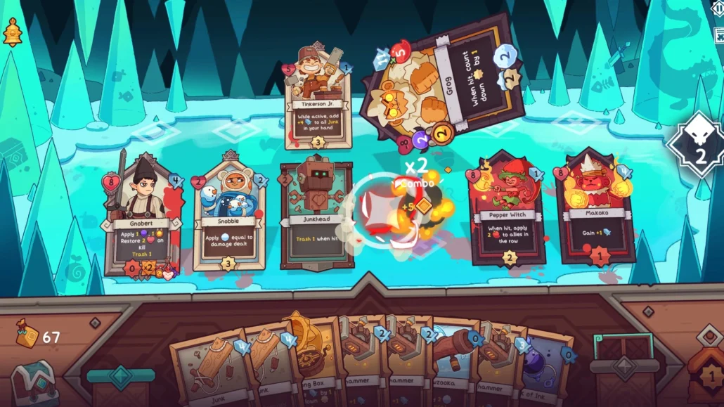
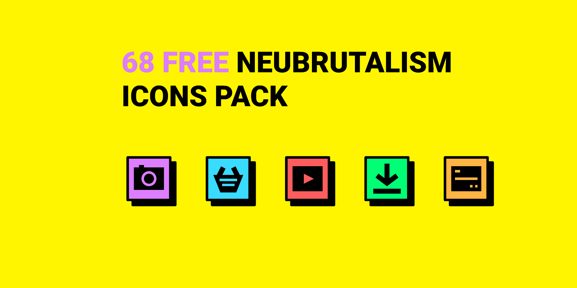
Neobrutalism is a design trend originating in web design that’s starting to make waves in game UI. It’s characterized by a raw, unpolished aesthetic – a deliberate rejection of the overly refined and "perfect’ interfaces we"ve seen for years. Think bold typography, stark color contrasts, and a willingness to embrace asymmetry.
In the context of game icons, this translates to thicker strokes, less reliance on gradients or subtle shading, and a generally more assertive visual style. It’s about prioritizing impact over polish. There’s a deliberate imperfection to it; a sense of something being "hand-made" rather than digitally perfected. This is a marked departure from the smooth, vectorized look of the recent past.
I think this shift is a direct pushback against how clean everything has become. People want grit. Neobrutalism feels immediate and raw, which works well for fast-paced action games that need an aggressive edge rather than a polished corporate look.
However, Neobrutalism isn’t without its challenges. It requires careful execution to avoid appearing simply sloppy or unfinished. The key is to balance the raw aesthetic with clear readability and usability. It's about controlled roughness, not just random chaos.
3D and isometric perspectives
While 2D icons still dominate the mobile landscape, we’re seeing a growing interest in 3D and isometric perspectives. These styles add depth and visual interest, creating a more immersive experience. A well-executed 3D icon can instantly elevate the perceived quality of a game’s UI.
The biggest hurdle, of course, is performance. 3D models require more processing power than simple vector graphics, and poorly optimized icons can lead to lag and battery drain. Developers are addressing this by employing techniques like low-poly modeling and texture compression. Stylized, rather than photorealistic, 3D icons are becoming increasingly popular.
Isometric icons offer a good compromise between visual appeal and performance. They provide a sense of depth without the same computational cost as fully 3D models. They're also relatively easy to integrate into existing 2D UIs. We're seeing this approach used frequently in strategy and simulation games.
The success of titles like Monument Valley demonstrated the power of isometric design early on, and that influence is now extending to icon design. These techniques aren't just about looking good; they’re about creating a more engaging and visually coherent experience for the player. I expect to see more experimentation with lighting and shading in 3D and isometric icons in the coming years.
Moving icons and feedback
Static icons are becoming a thing of the past. Animated icons are gaining traction as developers seek to add more personality and feedback to their UIs. Subtle animations can guide the player’s eye, provide visual confirmation of actions, and make the interface feel more responsive.
There are several types of animations being used. Looping animations, like a pulsing button or a rotating coin, are common. State-based animations, where an icon changes appearance based on its current state (e.g., a button changing color when pressed), are also effective. And micro-interactions—small, delightful animations that respond to user input—can significantly enhance the user experience.
The challenge is finding the right balance between visual appeal and performance impact. Overly complex or lengthy animations can be distracting and drain battery life. Optimization is key. Tools like Spine and Live2D are becoming increasingly popular for creating efficient 2D animations. Game engines like Unity and Unreal Engine also provide robust animation tools.
I'm seeing a trend towards more subtle and nuanced animations. The goal isn’t to overwhelm the player with flashy effects, but rather to provide clear and intuitive feedback. A well-timed animation can make a world of difference in terms of usability and engagement.
Bolder color palettes
Pastel color palettes have been a mainstay of mobile game UIs for a long time. They’re soft, approachable, and generally easy on the eyes. However, we’re seeing a shift towards bolder, more saturated colors, and even darker, more moody palettes. This reflects a broader trend in graphic design.
Color choice isn't just about what looks good. Bright, saturated tones keep energy high, while darker palettes set a moodier tone. We're seeing more developers pick colors that actually match the game's personality instead of sticking to safe, bright defaults.
I’m noticing a willingness to experiment with unconventional color combinations. Complementary colors are still popular, but we’re also seeing more use of analogous colors and triadic color schemes. The key is to create a visually harmonious palette that is both eye-catching and easy to read. Resources like Adobe Color are invaluable for exploring different color combinations.
Dark mode is also influencing color palette choices. Many games are now offering a dark mode option, which requires a different approach to color selection. Contrast is particularly important in dark mode, to ensure that icons and text remain legible.
- Complementary schemes use colors from opposite sides of the wheel, like red and green, to create high contrast.
- Analogous palettes use neighbors on the wheel, such as blue and green, for a smoother, more natural look.
- Triadic schemes pick three evenly spaced colors to keep things colorful but balanced.
- Triadic: Three colors equally spaced on the color wheel (e.g., red, yellow, and blue).
Mobile Game UI Color Palette Suitability - Projected Trends 2026
| Color Palette | Suitable Genres | Evoked Emotions | Accessibility Considerations |
|---|---|---|---|
| Pastel | Puzzle, Simulation, Casual | Calm, Relaxing, Approachable, Whimsical | Low contrast can be problematic for users with visual impairments. Careful attention to outlining and layering is crucial. |
| Vibrant | Action, Arcade, Hypercasual | Energetic, Exciting, Playful, Immediate | Can cause eye strain with excessive use or poor color combinations. Requires mindful contrast for readability. |
| Dark/Noir | RPG, Strategy, Horror | Intrigue, Sophistication, Immersion, Dramatic | Text and icons may lack sufficient contrast against dark backgrounds; requires bright, well-defined elements. Consider offering a high-contrast mode. |
| Monochrome (Variations of Gray) | Strategy, Minimalist Puzzle, Abstract | Clean, Modern, Sophisticated, Neutral | Reliance on shape and size for differentiation is critical. Not ideal for players with colorblindness; texture and pattern are essential. |
| Analogous (Colors adjacent on the color wheel) | Adventure, RPG, Story-driven Games | Harmonious, Peaceful, Cohesive, Natural | Can lack strong visual hierarchy if colors are too similar. Use value (lightness/darkness) to create clear distinctions. |
| Complementary (Colors opposite on the color wheel) | Action, Racing, Competitive Games | Dynamic, Bold, Attention-grabbing, High-contrast | Requires careful balancing to avoid visual clashes. Can be fatiguing if overused. |
| Limited/Retro (4-8 color palette) | Pixel Art, Classic-inspired Games, Simulation | Nostalgic, Charming, Unique, Intentional | Accessibility relies heavily on clear shape language and careful color selection to avoid ambiguity for colorblind users. |
Illustrative comparison based on the article research brief. Verify current pricing, limits, and product details in the official docs before relying on it.
Iconography and Cultural Relevance
As mobile games reach increasingly global audiences, cultural sensitivity and inclusivity in icon design are paramount. Icons should be recognizable and understandable to players from diverse backgrounds. Using symbols that may be offensive or misinterpreted in different cultures can severely damage a game’s reputation.
There’s a growing trend towards more abstract and universal icons that transcend cultural boundaries. Simple geometric shapes and universally understood metaphors are often the best choice. Avoid using culturally specific symbols unless you’ve thoroughly researched their meaning and potential implications.
It’s also important to consider accessibility. Icons should be designed to be easily distinguishable for players with visual impairments. Use clear, high-contrast colors and avoid relying solely on color to convey information. Provide alternative text descriptions for all icons.
Resources like the Unicode Consortium and cultural sensitivity guides can be invaluable for ensuring that your icons are appropriate and inclusive. Taking the time to do your research can save you a lot of trouble down the line.
Resources and Where to Find Icons
Finding high-quality game icons doesn’t have to be a struggle. Several excellent resources are available, catering to different budgets and needs. Spawn Icon, of course, offers a curated selection of premium game graphics and icons, designed to elevate the visual quality of your game.
Game-icons.net is a fantastic resource for free SVG and PNG icons. As of April 23, 2026, they boast a library of over 4180 icons, with new symbols added weekly. Itch.io also has a thriving community of asset creators, offering a wide range of icon packs, often at affordable prices.
Adobe Stock is another option, with a vast library of both vector and raster icons. However, the pricing can be significantly higher than on other platforms. When choosing between free and premium assets, consider the long-term value. Investing in high-quality assets can save you time and effort in the long run.
For learning resources, check out tutorials on icon design principles and best practices. Websites like Envato Tuts+ and Skillshare offer a wealth of educational content. Mastering the fundamentals of icon design will empower you to create custom icons that perfectly match your game’s aesthetic.
Nintendo on game development resources, says “development will inevitably become longer, more complex, and more advanced” https://t.co/H1WQwbG2XD pic.twitter.com/16WCrggkU3
— Nintendo Everything (@NinEverything) May 10, 2024
No comments yet. Be the first to share your thoughts!