
Get indie game icons right
Before you start drawing, define the visual language your game already owns. Indie game icons work best when they feel like part of a larger system rather than standalone assets. If your game uses hand-drawn textures, a clean vector icon will look out of place. If your game is minimalist, a cluttered icon will break the immersion.
Start by checking the technical constraints. Most storefronts and app stores require icons at specific resolutions, typically 512x512 or 1024x1024 pixels. Ensure your design remains legible at these sizes. A complex illustration that looks great on a monitor may become a muddy blob on a mobile app grid.
Also, consider the platform’s background. Steam, itch.io, and mobile stores often overlay borders or shadows. Design your icon on a neutral background first, then test it against white, black, and platform-specific themes. This simple check prevents contrast issues that make your icon hard to see in a crowded library.
Finally, gather reference material. Look at successful indie titles in your genre. Notice how they use color to signal mood or genre. You don’t need to copy them, but understanding the visual shorthand helps you create icons that players instantly recognize as part of your category.
Work through the steps
Indie Game Icon Design Trends works best as a clear sequence: define the constraint, compare the realistic options, test the tradeoff, and choose the path with the fewest hidden costs. That order keeps the advice usable instead of decorative. After each step, pause long enough to check whether the recommendation still fits the reader's actual situation. If it depends on perfect timing, unusual access, or a best-case budget, include a simpler fallback.
Common Mistakes in Indie Game Icon Design
Even skilled artists can undermine their game’s marketability through avoidable design errors. These mistakes rarely involve complex technical failures; they usually stem from ignoring how icons function in a crowded digital storefront. Fixing these issues is often simpler than creating new assets from scratch.
Ignoring Readability at Small Sizes
The most frequent error is designing icons that look detailed on a desktop monitor but dissolve into muddy blobs at 32x32 pixels. Players scan storefronts quickly. If they cannot distinguish a sword from a staff in half a second, the icon fails its primary job.
Scale your design down to 16x16 pixels early in the process. Check for contrast between the foreground and background. If your silhouette relies on subtle shading rather than shape, it will disappear on mobile devices or in list views. Simplify complex details into bold, distinct forms.
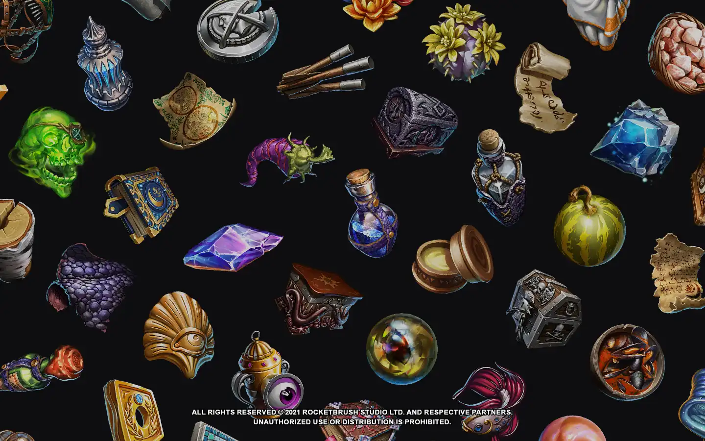
Using Generic or Cliché Symbols
Many indie developers default to overused symbols like dragons, swords, or crystals. While these communicate genre instantly, they also make your game blend into the thousands of other titles using the same visual language. A generic dragon icon suggests a generic RPG, not a unique experience.
Instead of relying on standard RPG tropes, look for visual metaphors specific to your game’s unique mechanics or story. A puzzle game might use interlocking gears; a horror game might use a distorted mirror. Originality in iconography signals originality in gameplay. Resources like Game-icons.net offer unique, non-cliché options that can help you break away from standard templates.
Inconsistent Visual Style
An icon is a promise of the game’s overall aesthetic. If your game features hand-painted textures but your icon uses flat vector shapes, players will feel misled. This mismatch creates a trust gap before they even click "Add to Cart."
Ensure your icon matches the art direction of your key art and UI elements. If your game is pixel art, your icon should use pixel-perfect rendering, not smoothed edges. Consistency reinforces brand identity and helps players instantly recognize your game across different platforms and marketing materials.
Indie game icon: what to check next
Before finalizing your premium game graphics, it helps to address the common technical and creative hurdles. Here are the practical answers to the questions indie developers ask most often when designing store-ready icons.
These guidelines ensure your design is not only visually appealing but also technically sound for distribution across multiple platforms. Focusing on clarity and scalability will help your game graphics compete effectively in a crowded market.
Helpful gear
Use these product recommendations as a starting point, then choose the size, material, and price point that fit how you actually use the gear.


As an Amazon Associate, we may earn from qualifying purchases.
No comments yet. Be the first to share your thoughts!