
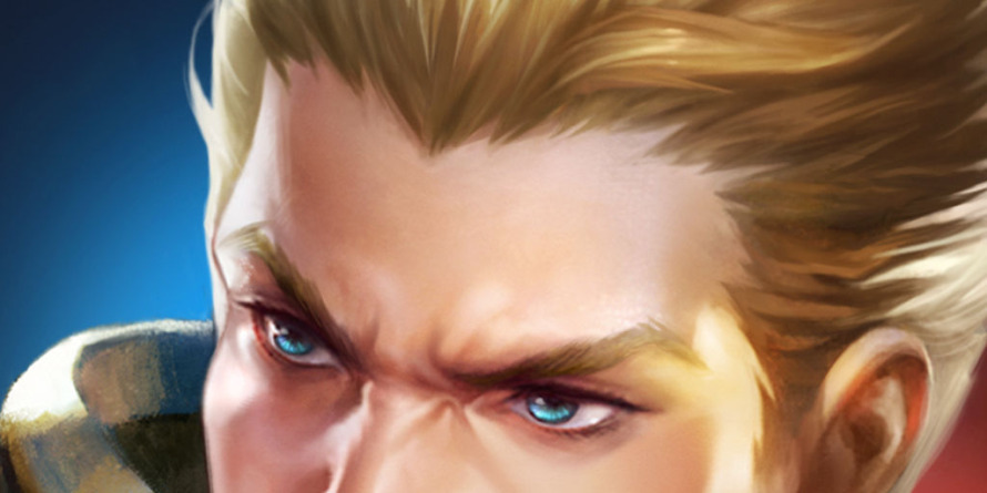
Pick your visual style first
Before hunting for assets, decide on the visual language for your project. A game icon is the first thing players see, so it must instantly communicate the game's tone. If your game is a cozy farming sim, a gritty military icon will feel out of place. Defining this direction early saves hours of editing and ensures downloaded assets fit the final product.
Think of your visual style as the foundation of a house. You wouldn't lay brick foundations under a wooden cabin. Similarly, you shouldn't mix pixel art with photorealistic 3D renders in your UI. Consistency builds trust. When every icon follows the same rules for line weight, color palette, and detail level, the entire interface feels polished and professional, even if you are using free assets.
To help you choose, look at three common styles:
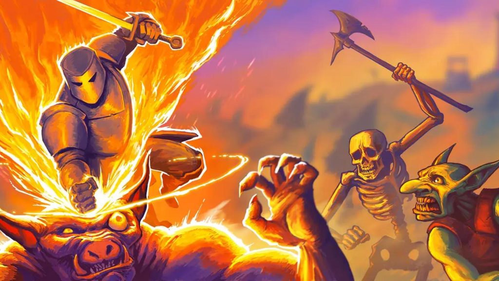
- Pixel Art: Best for retro or nostalgic games. These icons are made of distinct blocks and often use limited color palettes. They work well when you want to evoke a specific era of gaming.
- Vector/Flat Design: Ideal for modern mobile games or casual puzzles. These use clean shapes, smooth curves, and bold colors. They scale well to any size and remain readable on small screens.
- Realistic/Hand-Drawn: Suitable for RPGs or narrative-driven games. These icons often feature detailed textures, shadows, and organic lines. They convey a sense of depth and story.
Once you pick a direction, stick to it. Mixing styles can break immersion and make your project look unfinished.
Download icons in the right format
Choosing the right file format is less about personal preference and more about how your game engine will handle the image. A PNG might look perfect on your desktop, but it can become pixelated or heavy when scaled across different screen sizes in your final build. Getting this decision right early on saves you from re-downloading assets or tweaking code later.
Here is how to pick the best format for your specific needs:
PNG: The Safe Default
PNG is the most common choice for indie developers because it supports transparency and looks crisp at a fixed size. If your game uses a strict grid system or you are downloading a large batch of UI elements, PNG is usually the safest bet. It ensures that your icons remain sharp and consistent without requiring complex scaling logic in your code. However, remember that PNG files can get large quickly, which might impact your initial load times.
SVG: For Scalable Clarity
SVG (Scalable Vector Graphics) is ideal if you need your icons to look sharp on high-resolution displays or if you plan to scale them up for different UI states. Because SVGs are mathematically defined rather than pixel-based, they never lose quality when resized. This is particularly useful for main menu icons or branding elements where clarity is paramount. Most modern game engines support SVG, but check your specific engine’s documentation to ensure compatibility.
Sprite Sheets: For Performance
If you are building a 2D platformer or a game with many moving parts, sprite sheets are the way to go. A sprite sheet combines multiple icons into a single image file, which reduces the number of draw calls your engine has to make. This can significantly boost performance, especially on mobile devices. While it requires a bit more setup to extract individual icons, the performance gains are often worth the extra effort.
Before adding your new icons to the project, open each file to ensure there are no artifacts or transparency issues. Check that the dimensions match your engine’s requirements and that the file size is reasonable for your target platform.
Place the icons in your game’s UI or scene and run a quick test. Look for any scaling issues, color shifts, or performance drops. This step ensures that the format you chose actually works well in the final environment.
Check licensing for commercial use
Before you add a game icon download to your project, you must verify how it can be used. Many assets are labeled "free," but that label often comes with strict conditions. Ignoring these details can lead to legal trouble or force you to pull your game from stores later.
Start by distinguishing between the three main license types you will encounter. A Creative Commons (CC) license usually requires attribution, meaning you must credit the creator in your game’s credits or store description. A royalty-free license allows you to use the asset without paying per download, but it does not mean the asset is free of cost or restrictions. Finally, premium licenses typically offer broader rights and fewer restrictions, but they require an upfront purchase.
Always read the specific terms on the download page. Look for keywords like "commercial use allowed" or "no attribution required." If the license is unclear, contact the creator directly. It is better to spend ten minutes clarifying a license than to face a takedown notice after launch.
Keeping your license documentation organized is just as important as finding the right icon. Save a copy of the license text or a screenshot of the terms page alongside your asset files. This simple habit creates a clear paper trail that protects your indie project if any questions arise in the future.
Test icons in your game engine
Downloading a crisp icon is only half the battle. What looks perfect on a website often falls apart when dropped into a game engine. Lighting, UI scaling, and compression can turn a sharp symbol into a muddy blob. To save yourself from last-minute reworks, preview every candidate inside your actual development environment before committing to it.
Import and place the icon
Start by adding the icon file to your project’s asset folder. Most engines, like Unity or Godot, will automatically import PNG or SVG files. Drag the icon into your UI canvas or HUD layer where it will appear in-game. If you are using a sprite atlas, make sure the icon is included in the build so it doesn’t disappear during runtime.
Check scaling at actual sizes
Game icons rarely appear at their full resolution. They are often shrunk down to 32x32 or 64x64 pixels for menus or inventory slots. Zoom out in your engine’s viewport to see how the icon looks at these small sizes. If details get lost or edges become jagged, the icon may need simplification. A good rule of thumb is to view the icon at 10% of its original size on your monitor to simulate the player’s experience.
Verify color contrast and clarity
Lighting in your game engine can drastically change how colors appear. An icon that looks bright and clear in a design tool might look dull or invisible against your game’s background. Test the icon under different lighting conditions and against various background colors. Ensure there is enough contrast between the icon and its surroundings so players can identify it instantly. Poor contrast is a common reason players miss important UI cues.
Review in the final build
The ultimate test is running the game. Play through the sections where the icon appears. Watch how it behaves when the camera moves or when the UI animates. Sometimes, subtle issues like transparency glitches or animation hiccups only show up in the compiled build. If the icon looks good in the editor but fails in the final game, you will need to adjust its properties or replace it.
Tools for asset management
Managing multiple icon versions can get messy. Use asset management tools to keep your original designs and engine-ready versions organized. This helps you track which icons have been tested and which still need review. Some tools also offer batch processing to resize icons for different resolutions, saving you time during the testing phase.


As an Amazon Associate, we may earn from qualifying purchases.
Keep your asset library organized
A messy asset folder is a project killer. You download a "sword icon," only to realize three weeks later it’s 64x64 pixels when you needed 128x128. Or worse, you have five versions of the same coin, and you can’t remember which one has the transparent background.
Treat your icon library like a well-stocked kitchen. If everything is in one giant drawer, you’ll waste time searching for the right tool. If it’s labeled and sorted, you’ll build faster. Here is a simple workflow to keep your game icons tidy from download to deployment.
1. Standardize your folder structure
Create a dedicated assets/icons folder in your project root. Inside, use subfolders based on function or category, not by source website.
ui/: Buttons, menus, and HUD elements.items/: Collectibles, weapons, and resources.characters/: Avatars, portraits, and status indicators.
This structure scales. If you add 500 icons later, you’ll still know exactly where to look.
2. Name files with purpose and clarity
Avoid generic names like icon123.png or final_v2_real.png. Use a consistent naming convention that tells you what the file is and its dimensions.
Format: category_description_size.ext
Examples:
ui_button_play_64.pngitem_sword_steel_32.pngchar_avatar_hero_128.png
This makes it easy to search for assets using your code editor’s global search feature.
3. Enforce visual consistency
Icons from different sources often have mismatched styles. One might be flat, another isometric, and a third uses a different color palette.
- Check style: Ensure all icons in a category share the same line weight, corner radius, and perspective.
- Check size: Convert all icons to a standard base size (e.g., 32x32 or 64x64) before adding them to your project.
- Check format: Stick to one primary format (PNG for transparency, SVG for scalability) to keep your build pipeline simple.
4. Version control your assets
Don’t let asset files bloat your git history. Use a .gitignore file to exclude large binary assets if your project uses a separate asset server or CDN. If you store them locally, commit them regularly with clear messages.
Good commit message: Add 10 new UI icons for inventory screen
Bad commit message: update icons
5. Audit before release
Before you ship, do a quick sanity check. Open your game in development mode and browse every screen. Look for:
- Broken image links (missing files).
- Blurry or pixelated icons (wrong resolution).
- Inconsistent colors or styles.
Fixing these issues early saves hours of debugging later.
-
All icons render correctly at target resolution
-
File names follow the `category_description_size.ext` convention
-
No duplicate icons with different names
-
Visual style is consistent within each category
-
No broken links or missing assets in the build
Common mistakes when downloading icons
The easiest mistake is comparing options on the most visible detail while ignoring the day-to-day constraint. A choice can look strong on paper and still fail because it is too hard to maintain, too expensive to repeat, or awkward in the actual setting.
Use the same checklist for every option: fit, cost, durability, timing, upkeep, and fallback plan. That keeps the comparison practical instead of drifting into preference alone.
The simplest way to use this section is to write down the real constraint first, compare each option against it, and choose the path that still works outside ideal conditions.
No comments yet. Be the first to share your thoughts!