

The visual economy of indie games
In the crowded marketplace of 2026, an indie game icon is not merely decorative; it is the primary conversion driver. Players make split-second decisions in storefronts, and the visual quality of your icon directly signals the quality of your game graphics. A polished icon suggests a premium experience, while a sloppy one suggests amateur development, regardless of how deep the gameplay mechanics are.
This visual economy demands that indie developers treat their icons with the same rigor as their core code. A high-fidelity icon acts as a digital handshake, promising that the internal world matches the external presentation. When your icon reflects professional standards, you compete effectively against larger studios, leveraging visual credibility to capture attention before a single pixel of gameplay is rendered.
Scalable SVG and Color Consistency
An indie game icon must survive the transition from a developer’s desktop to a crowded mobile storefront. The visual strategy for 2026 launches relies on technical precision rather than artistic flair alone. If an icon blurs at small sizes or shifts hue across different operating systems, it loses its competitive advantage before a single user clicks.
Vector graphics are the foundation of this reliability. Scalable Vector Graphics (SVG) allow icons to resize without pixelation, ensuring clarity on everything from a 4K monitor to a smartwatch. This format is not just a design preference; it is a technical requirement for modern asset pipelines. Platforms like Game-icons.net provide extensive libraries of free SVG assets that maintain their structural integrity at any scale, offering a reliable starting point for indie developers who need professional-grade symbols.
Color consistency is equally critical. A palette that looks vibrant on a calibrated screen may appear muddy or oversaturated on a mobile device with different color profiles. To mitigate this, designers should limit their palette to high-contrast colors that remain distinct under various lighting conditions. Testing icons across multiple device simulators helps identify these discrepancies early, preventing the need for costly redesigns post-launch.
The visual strategy for 2026 launches demands that every pixel serves a purpose. By prioritizing SVG scalability and rigorous color testing, indie developers can ensure their icons remain sharp, recognizable, and professional. This attention to detail signals quality to players, turning a simple visual element into a powerful marketing tool.
![CorelDRAW Graphics Suite | 1 Year Subscription | Graphic Design Software for Professionals | Vector Illustration, Layout, and Image Editing [PC/Mac Download]](https://m.media-amazon.com/images/I/71JSkAcruxL._AC_UY654_QL65_.jpg)


As an Amazon Associate, we may earn from qualifying purchases.
Premium Resources for Indie Game Icons
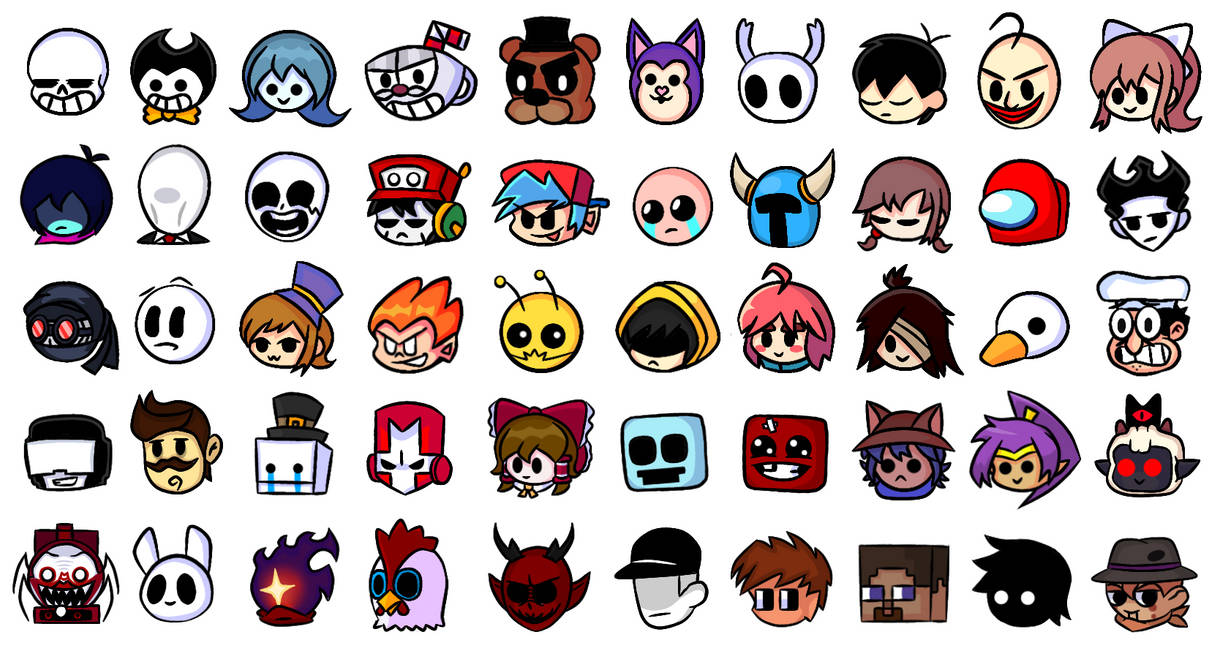
High-quality visual assets are a competitive advantage for 2026 launches. Indie developers need icon sets that balance distinct branding with technical performance. The following resources provide premium game graphics tailored to indie workflows, ranging from open-source libraries to professional marketplaces.
Game-Icons.net
This repository offers over 4,000 free icons in both SVG and PNG formats. The collection is organized by intuitive categories, making it easy to find specific UI elements without extensive searching. The consistent artistic style ensures that mixed assets still look cohesive within a single project.
Icons8
Icons8 provides a massive library of indie game icons across more than 50 distinct UI design styles. Users can download static and animated vectors in PNG, SVG, and GIF formats. This flexibility allows developers to maintain visual consistency while adapting to different interface requirements.
itch.io Asset Store
The itch.io marketplace hosts a wide variety of indie-focused icon packs, including pixel art and cyberpunk themes. Many creators offer free 32x32 and 64x64 pixel sets specifically designed for retro-style games. These assets often come with detailed licensing terms that support commercial use.
Adobe Stock
For developers seeking unique, high-fidelity graphics, Adobe Stock offers thousands of royalty-free images and vectors. This platform is ideal for projects requiring custom branding or premium visual identity elements that stand out from standard asset packs.
| Source | Cost | Formats | License |
|---|---|---|---|
| Game-Icons.net | Free | SVG, PNG | CC-BY 3.0 |
| Icons8 | Freemium | SVG, PNG, GIF | CC-BY 4.0 (Free) |
| itch.io | Free/Paid | PNG, SVG | Varies by creator |
| Adobe Stock | Paid | AI, EPS, PNG | Royalty-Free |
Integrating Icons Into the Launch Funnel
An indie game icon is not a static asset; it is a functional component of your marketing funnel. It must perform across disparate environments, from the high-density grid of the Steam store to the thumbnail view of social media feeds. The visual strategy for 2026 launches relies on this adaptability. A design that looks premium in isolation may fail when scaled down to 32x32 pixels in a mobile app store.
Store Pages and App Store Optimization
On storefronts, the icon competes with dozens of other titles for attention. It serves as the primary visual anchor for your App Store Optimization (ASO) and Steam store page. The design must communicate the game’s genre and tone instantly. Cluttered details that work in a large banner become muddy noise at thumbnail size. Prioritize high-contrast shapes and limited color palettes that remain legible under small dimensions.
Social Media and Community Assets
Beyond the storefront, the icon becomes a brand identifier across social platforms. It appears in Twitter/X avatars, Discord server icons, and Reddit community thumbnails. Consistency here builds recognition. When players see your icon repeatedly across different channels, it reinforces trust and professionalism. This repetition turns casual scrollers into engaged community members who recognize your brand before they even read the title.
Cross-Platform Consistency
Maintaining visual integrity across all touchpoints is essential. The icon should retain its core elements whether displayed on a desktop monitor or a mobile device. This consistency ensures that your marketing efforts feel cohesive rather than fragmented. A unified visual identity signals to players that your team is organized and attentive to detail, qualities that translate into perceived game quality.
Building a cohesive visual identity
A cohesive visual identity is the difference between a game that feels polished and one that looks like a prototype. In the indie market, premium game graphics serve as a primary competitive advantage, signaling quality before the player launches the executable. Consistency across your iconography ensures that your brand remains recognizable across storefronts, social feeds, and app stores.
Start by defining a strict style guide for your indie game icons. Limit your palette to three or four core colors and stick to a single line weight or shape language. This discipline prevents visual noise and allows key assets, like a character or logo, to stand out. When every icon shares the same structural DNA, your collection feels intentional rather than assembled.
Source your assets from reputable platforms to maintain professional standards. Curated libraries like The Noun Project offer consistent, high-resolution vector icons that can be customized to match your brand’s specific tone. Avoid mixing styles from disparate sources, as this fragmentation dilutes brand trust. Treat your visual assets with the same rigor as your code.
KeyTakeaways items=['Consistency in style builds immediate brand recognition', 'Premium graphics signal quality and professionalism', 'Use curated sources to maintain visual standards']
No comments yet. Be the first to share your thoughts!