
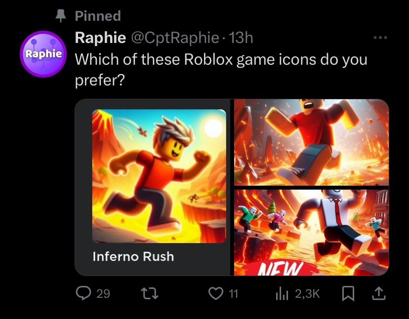
Current icon style trends
By 2026, the era of wild experimentation has settled into a focus on execution. Minimalist designs—flat colors and simple shapes—still dominate the charts because they work. In a crowded store, a puzzle game icon needs to be readable in half a second, or the player scrolls past.
Isometric icons remain present, though their peak popularity has passed. You'll see them in strategy and simulation games where representing a world view is important. 3D renders are also still around, but developers are increasingly cautious about file size. Gradients are everywhere, but they’re becoming more subtle, almost pastel-like, which we’ll explore further. Pinterest is a great place to visually see how these styles manifest; a quick search for “mobile game icons” reveals a lot of this.
Genre plays a huge role. Hypercasual games almost exclusively use bright, simple icons with a clear call to action. RPGs tend towards more detailed and dramatic imagery, often featuring character art or weaponry. Puzzle games often opt for abstract shapes and calming color palettes. The key takeaway is that there isn't one dominant trend, but a spectrum of styles adapted to specific audiences.

The shift toward soft aesthetics
I’ve noticed a significant shift towards what I’m calling "soft’ game icons. These icons are characterized by rounded shapes, pastel colors, and subtle gradients. They"re designed to feel inviting and approachable, a stark contrast to the harsh lines and aggressive colors that were popular a few years ago. Scrolling through Pinterest confirms this; the boards dedicated to mobile game icons are filled with this aesthetic.
This shift works because players are burnt out on high-friction visuals. A rounded, pastel icon promises a low-stress experience. It’s a visual shorthand for 'this won't frustrate you,' which is a powerful draw for the cozy gaming demographic.
Technically, creating this style isn’t always easy. Achieving smooth gradients without visual banding requires careful attention to detail. Avoiding visual clutter is also crucial; too many elements can make the icon look messy and unprofessional. The goal is to create something that’s visually appealing but also incredibly clean and easy to understand.
Isometric icons in 2026
Isometric icons had a moment. They were the thing for strategy and simulation games for a while. But in 2026, their presence feels… diminished. They haven’t disappeared, but they’re less prevalent. I suspect this is because the style can easily look dated if not executed with exceptional skill. A poorly rendered isometric icon can feel instantly old.
However, they still have a place. In games where representing a top-down view of a world is essential – city builders, resource management games, certain RPGs – isometric icons can be incredibly effective. The key is to update the style. Think more dynamic lighting, interesting camera angles, and more detailed textures.
Game-icons.net has a good selection of isometric icons, and it’s interesting to see how the designs have evolved over time. More recent additions incorporate more subtle shading and texture work, indicating a move away from the purely flat, blocky aesthetic of the past.
3D Renders: A Performance Tradeoff
3D icons offer depth that flat art can't hit, but they come with a weight penalty. High-poly renders and unoptimized textures bloat the initial app store package. If your icon looks great but adds 5MB to a 'quick' download, you'll lose players on spotty connections.
Are developers willing to sacrifice performance for visual fidelity? It depends. For high-profile games with large budgets, the answer is often yes. But for smaller indie developers, the decision is more complex. They need to carefully weigh the benefits of 3D rendering against the potential impact on user experience. Optimization is key. Using lower-resolution textures, reducing polygon counts, and compressing the icon file can help mitigate the performance impact.
Software like Blender and Cinema 4D are commonly used to create 3D game icons. There’s a learning curve involved, but the results can be stunning. The biggest challenge is often finding a balance between visual quality and technical performance.
Color Palettes: Beyond the Rainbow
Color is a powerful tool in icon design. What color palettes are performing well in 2026? I’ve been analyzing the top-grossing mobile games, and I’m seeing a trend towards more sophisticated and nuanced color schemes. The days of blindingly bright, saturated colors are largely over.
We’re seeing a lot of muted tones, earthy colors, and pastel shades. Think dusty blues, olive greens, and muted oranges. These palettes convey a sense of calm and sophistication. However, bold colors are still effective in certain genres, particularly hypercasual games where the goal is to grab attention quickly.
The psychological impact of color is also important. Blue is often associated with trust and reliability, while green is associated with nature and growth. Red is associated with excitement and energy, but it can also be perceived as aggressive. Developers need to carefully consider the message they want to convey when choosing a color palette. Again, Pinterest is a good resource for spotting current color trends.
Mobile Game Icon Color Palette Trends - Projected 2026
| Palette Name | RPG/Fantasy Fit | Puzzle/Strategy Fit | Hypercasual Fit | Emotion Evoked | Trend Score (1-5 Stars) |
|---|---|---|---|---|---|
| Pastel | Medium | High | Low | Calm, Approachable, Whimsical | 3 Stars |
| Neon | Low | Medium | High | Energetic, Futuristic, Exciting | 4 Stars |
| Monochrome (Grayscale) | Medium | Medium | Medium | Sophisticated, Minimalist, Clean | 3.5 Stars |
| Earthy Tones | High | Medium | Low | Natural, Grounded, Relaxing | 2.5 Stars |
| Vibrant/Saturated | High | Medium | High | Playful, Bold, Attention-grabbing | 4 Stars |
| Dark & Moody | High | Low | Medium | Intriguing, Mysterious, Dramatic | 3 Stars |
| Retro/8-bit | Medium | Medium | Medium | Nostalgic, Playful, Classic | 3.5 Stars |
Illustrative comparison based on the article research brief. Verify current pricing, limits, and product details in the official docs before relying on it.
Iconography: What Symbols Resonate?
What symbols are players immediately recognizing and clicking on in 2026? Some things remain consistent. Swords are still effective for RPGs, gems are still associated with puzzle games, and crowns still signify royalty or strategy. But there’s a risk of overuse. Players have seen these symbols countless times, and they may no longer have the same impact.
The key is to find fresh takes on familiar symbols. For example, instead of a generic sword, use a uniquely designed weapon that reflects the game’s art style. Instead of a simple gem, use a cluster of gems or a gem with a special effect. It's also crucial to be mindful of cultural sensitivities when choosing icons. A symbol that’s harmless in one culture might be offensive in another.
Game-icons.net is a fantastic resource for finding a wide variety of symbols. They have a huge library of icons, and they’re constantly adding new ones. It’s a great place to start when brainstorming ideas.
- Swords: Use specific silhouettes like a notched claymore or a glowing rapier rather than the standard vertical blade.
- Gems: Associated with puzzle games, consider variations.
- Crowns: Signify strategy or royalty, avoid clichés.
- Arrows: Indicate direction or action, use creatively.
Common Mobile Game Icons
- Sword - Still a powerhouse for RPGs and action games, but saturation is *high*. Players instantly recognize it, but it needs a unique visual twist to stand out. Consider silhouette variations or material effects.
- Gem/Crystal - Universally understood as representing value or currency. Effectiveness remains strong, particularly for puzzle and strategy games. Risk of overuse is moderate; unique cuts and color palettes help.
- Potion - Reliably conveys healing or power-ups. Very common in RPGs and adventure games. Trend Score: ⭐⭐. Needs strong visual differentiation – think bubbling effects or unusual colors.
- Crown/Tiara - Signals royalty, leadership, or special status. Effective for strategy, kingdom-building, and some RPGs. Trend Score: ⭐⭐⭐. Can feel a bit cliché if not creatively implemented.
- Shield - Represents defense and protection. Popular in RPGs, strategy, and tower defense games. Trend Score: ⭐⭐. Consider dynamic shield designs – cracked, glowing, or with unique emblems.
- Treasure Chest - Classic symbol of rewards and loot. Works well for adventure, RPG, and casual games. Trend Score: ⭐⭐⭐⭐. Still performs well, especially with visual cues like overflowing gold or animated openings.
- Coin/Gold Pile - Directly represents in-game currency. Highly recognizable, but can be visually bland. Trend Score: ⭐. Focus on dynamic animations or unique coin designs to avoid looking generic.
Assets & Resources: Where to Find Icons
So, you need icons. Where do you start? Game-icons.net is a great free resource, offering over 4180 SVG and PNG icons as of April 23, 2026. It’s constantly updated with new symbols, organized into intuitive categories. Itch.io is another excellent option, with a wide range of both free and paid icon assets. You can find everything from minimalist designs to detailed 3D renders.
The pros and cons of free vs. paid assets are pretty straightforward. Free assets are a good way to get started, but the quality can vary. Paid assets are typically more polished and professional, but they come with a cost. If you have a specific vision for your icons, commissioning custom work from a freelance artist might be the best option.
Websites like Fiverr and Upwork connect you with talented designers who can create custom icons to your exact specifications. Be sure to check their portfolios and read reviews before hiring someone. A well-designed icon can make a huge difference in your game’s success.
Icon Design Directions
- Neo-Brutalism - Expect stark, almost aggressively simple shapes and bold, high-contrast color palettes. Think raw, unfinished aesthetics.
- Gradient Revival - Gradients are back, but more sophisticated. Subtle, realistic gradients mimicking light and material are replacing the flat, vibrant gradients of the past.
- 3D Render Minimalism - Highly detailed 3D renders, but with a focus on clean compositions and limited color schemes. The goal is a premium look without visual clutter.
- Illustrated Characters (Stylized) - Hand-drawn or digitally painted characters with a strong stylistic flair. Think less realism, more personality and unique proportions.
- Glitch & Data-Moshing Effects - Icons incorporating visual distortions, pixel sorting, and other digital artifact aesthetics. Appeals to a tech-savvy audience.
- Isometric Depth - Icons using isometric perspective to create a sense of depth and dimension, even within a 2D design. Popular for strategy and simulation games.
- Dynamic Lighting & Shadows - More emphasis on realistic lighting and shadows to make icons 'pop' and feel more tangible. This goes beyond simple drop shadows.

No comments yet. Be the first to share your thoughts!