
How icons evolved
Early mobile game icons were largely dictated by technical limitations. The first wave of games on feature phones relied heavily on pixel art, with designers working within incredibly tight constraints. As smartphones emerged, the shift towards higher resolution displays allowed for more detail and complexity, triggering a period of experimentation with gradients and skeuomorphism.
The rise of flat design around 2012 was a significant turning point. This aesthetic prioritized simplicity and clarity, aligning with the minimalist trends in broader UI/UX design. While flat design remains prevalent, it’s evolved considerably. We're seeing a move away from purely two-dimensional icons towards designs that incorporate subtle depth and texture.
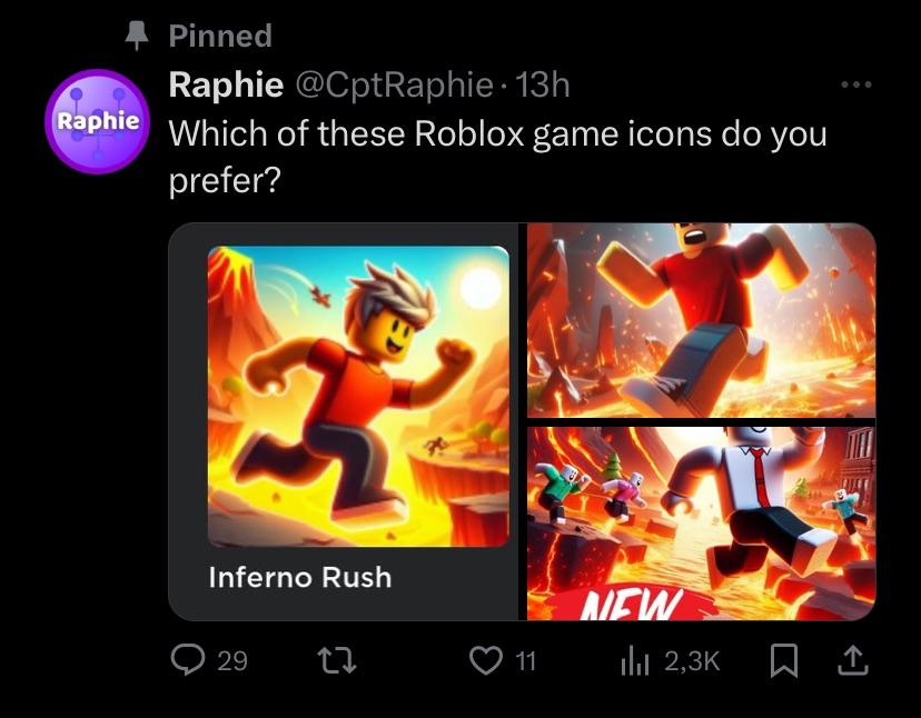
An icon is usually the only chance you get to grab a player's attention. If it doesn't clearly signal the genre and vibe immediately, people just keep scrolling. It's the most basic part of ASO, but also the hardest to get right.

Adaptive icons in iOS 18
Apple has consistently pushed for greater system integration and visual consistency across iOS. With iOS 18, I anticipate continued development of adaptive icons, building on the foundation laid by previous updates. While fully dynamic icons that change dramatically based on context are still unlikely, expect more sophisticated options for responding to user interactions and system themes.
One potential area of development is improved support for icon masking. This would allow developers to create a base icon design and then let the system apply different color filters or effects to match the user’s chosen aesthetic. This approach strikes a balance between brand identity and system harmony. There’s speculation about new APIs allowing for subtle animations within the icon itself, triggered by long presses or other gestures.
Apple is getting stricter about misleading imagery. If your icon looks like a system notification or uses 'sale' badges that aren't there, expect a rejection. They want icons that look like they belong in the OS, not like desperate ads.
The introduction of AI Studio within Adobe Stock suggests Apple is further investing in generative AI tools. It’s possible iOS 18 could integrate AI-powered icon design assistance, helping developers quickly create variations or optimize their icons for different contexts. This is largely speculative, but it aligns with Apple’s broader AI strategy.
- Better masking to match system themes
- Subtle animations on interaction
- Tighter adherence to Apple’s design guidelines
Android 15 and material you
Google’s Material You design language, introduced with Android 12, has fundamentally altered the approach to UI design on Android devices. Android 15 will likely refine and expand upon these principles, offering developers even more opportunities to create visually cohesive experiences. The core concept is dynamic color theming – icons adapt their color palettes to match the user’s wallpaper and system theme.
The challenge for game developers is maintaining brand identity while adhering to Material You’s principles. Simply allowing the system to apply arbitrary colors can result in an icon that feels disconnected from the game’s overall aesthetic. Careful consideration must be given to color selection and contrast to ensure the icon remains recognizable and appealing.
I’m curious to see if Google will offer more granular control over color palettes in Android 15. Currently, developers have limited options for specifying which colors should be used for theming. Greater control would allow for a more nuanced and brand-consistent implementation of Material You. The system currently relies on extracting dominant colors from the wallpaper, which isn’t always ideal.
Unlike Apple’s approach, Android’s openness allows for a wider range of customization options. Developers can choose to fully embrace Material You, partially implement it, or opt out altogether. This flexibility is both a blessing and a curse – it requires more decision-making but also allows for greater creative freedom.
Trending Styles: Minimalism and 3D
Minimalism continues to be a dominant trend in mobile game icon design. Clean lines, simple shapes, and a limited color palette remain popular choices. However, we’re seeing a shift towards "sophisticated minimalism" – designs that incorporate subtle gradients, shadows, and textures to add depth and visual interest.
The increasing accessibility of 3D modeling tools has led to a surge in the popularity of 3D icons. These icons often feature soft shadows, subtle gradients, and realistic lighting effects. While 3D icons can be visually striking, they require careful execution to avoid appearing cluttered or distracting. A poorly designed 3D icon can easily get lost in a crowded app store.
Minimalist icons scale well on small screens but risk looking generic. 3D icons stand out and feel high-end, though they often turn into a muddy mess if the lighting and shadows are too busy.
I expect to see a continued blending of these two styles. Designers will increasingly experiment with combining minimalist principles with 3D elements to create icons that are both visually appealing and functionally effective. The key is to find a balance between simplicity and detail.
Emerging Icon Styles
- Neo-Minimalism - A continuation of current trends, focusing on extremely simplified shapes and bold, flat color palettes. Expect increased use of negative space and subtle gradients for depth. This builds on the aesthetic seen in popular titles like Monument Valley.
- Dynamic 3D Icons - Leveraging advancements in rendering capabilities, icons will feature more complex 3D models with subtle animations or shifting perspectives. This is a direct response to discussions on r/gamedev, where users expressed appreciation for visually striking 3D icons. Think icons that *react* to system themes.
- Glassmorphism & Acrylic Effects - Inspired by UI design trends, icons will incorporate blurred backgrounds and translucent layers to create a sense of depth and realism. This relies on the increasing power of mobile GPUs.
- Isometric Representations - Isometric designs are gaining traction, offering a unique perspective that can showcase gameplay elements within the icon itself. This allows for more detailed and informative icons without sacrificing clarity.
- Character-Focused Icons (Stylized) - While character icons aren't new, 2026 will see a shift toward highly stylized, almost caricature-like representations of in-game characters. This is driven by a desire for memorability and instant recognition.
- Adaptive Icons (Platform Specific) - iOS 18 and Android 15 are expected to further refine their adaptive icon systems. Designers will need to create icons that seamlessly adapt to different shapes and sizes without losing visual integrity. This will require careful consideration of safe zones and scaling.
- Textured & Grainy Aesthetics - A reaction against the overly polished look of many current icons, expect to see increased use of subtle textures and grain to add visual interest and a more handcrafted feel.
Iconography: What Symbols Resonate?
The use of iconography is a powerful tool for communicating a game’s genre and gameplay. Certain symbols have become strongly associated with specific game types – a sword for RPGs, a gun for shooters, a puzzle piece for puzzle games. However, relying on overused symbols can result in an icon that blends in with the competition.
I’ve noticed a lot of icons using abstract shapes, but they often lack immediate recognition. While abstract designs can be visually interesting, they require more effort from the user to decode. A good icon should convey its meaning instantly. A successful icon taps into shared cultural understandings.
Currently, symbols representing speed, action, and competition (e.g., arrows, flames, stylized characters in motion) are popular. However, originality is key. Developers should strive to create unique and memorable icons that stand out from the crowd. Consider incorporating elements that are specific to your game’s story or characters.
Before settling on an icon, it’s crucial to test it with your target audience. Gather feedback on its clarity, memorability, and overall appeal. A/B testing different icon variations can help you identify the most effective design.
Mobile Game Icon Symbol Decision Matrix - 2026 Considerations
| Symbol | Genre Association | Memorability | Potential Issues |
|---|---|---|---|
| Sword | Strong association with RPGs, Action, and Strategy games. Moderate fit for Fantasy. | Generally high, particularly within associated genres. Recognizable silhouette. | Can appear generic if not uniquely styled. May not resonate with casual game audiences. |
| Gem | Commonly used in Puzzle, Match-3, and RPGs (as loot). Some association with resource management. | Moderate. Recognizable, but can blend in with other shiny objects in app stores. | Risk of appearing too similar to icons for other games, especially in casual genres. May imply a 'pay-to-win' mechanic if overemphasized. |
| Character | Highly versatile, dependent on character design. Can fit almost any genre. | Potentially very high, especially with unique and appealing character art. Strong for branding. | Requires high-quality art. Can be difficult to represent gameplay at a glance. May not scale well to smaller sizes. |
| Shield | Strongly associated with Defense, Strategy, and RPGs. Moderate fit for Action games. | Moderate. Easily recognizable, but can be somewhat static visually. | May imply a purely defensive or slow-paced game. Can lack excitement. |
| Potion | Frequently used in RPGs and Adventure games, suggesting healing or power-ups. | Moderate. Recognizable within the RPG/Adventure space, but less universal. | Can be easily confused with other circular icons. May not clearly convey the game's core mechanic. |
| Dice | Strong association with board games, strategy, and luck-based games. | Moderate. Recognizable, but limited genre appeal. | May not attract players seeking fast-paced action or skill-based gameplay. |
| Crown | Often used in Strategy, Simulation, and RPGs, implying leadership or royalty. | Moderate. Recognizable, but can feel cliché. | May suggest a focus on empire building or management, potentially excluding other gameplay styles. |
Illustrative comparison based on the article research brief. Verify current pricing, limits, and product details in the official docs before relying on it.
Designing for accessibility
Accessibility is often overlooked in icon design, but it’s a crucial consideration. Developers have a responsibility to ensure their icons are easily recognizable by users with visual impairments. This requires careful attention to color contrast, shape clarity, and the use of alternative text.
Ensure sufficient contrast between the icon and its background. Users with low vision may struggle to distinguish icons that have similar colors. Use clear, simple shapes that are easy to discern. Avoid overly complex or detailed designs. Providing alternative text descriptions for your icons is essential for screen reader users.
This isn’t just about ethical considerations; it’s also about reaching a wider audience. By making your icons accessible, you’re opening up your game to more potential players. There’s a real opportunity to lead in this area and demonstrate a commitment to inclusivity.
Tools like WebAIM’s Color Contrast Checker can help you assess the contrast ratio of your icon designs. Regularly audit your icons to ensure they meet accessibility standards and remain usable for all players.
Chica appeared in the side scrolling RPG called Creepy Castle! She appears here along side other indie game icons and this is the only official FNAF crossover at the time of this tweet! 🏰
— fazfactz! 🎩🍉🏳️🌈 (@fazfactz) March 26, 2023
(Image Source - @/dopterra) pic.twitter.com/qhMcjYP2DH

No comments yet. Be the first to share your thoughts!