
Small teams, bigger visuals
The era of the bloated AAA studio dominating the spotlight is fading. In 2026, the industry default has shifted decisively toward small, agile teams. As noted by Game Makers, "Going Small: Small teams aren't a trend. They're the new default." This structural change means indie developers and solo creators are no longer competing on budget alone; they are competing on vision, speed, and asset quality.
This shift creates a paradox for smaller studios: you have limited manpower but audience expectations that rival blockbuster titles. Players today expect polished, cohesive art direction, even in pixel-perfect or stylized indie games. The gap between "indie" and "AAA" visuals has narrowed, not because indies have more money, but because the tools for acquiring and creating high-fidelity assets have become more accessible.
For a small team, every sprite and icon must work harder. You cannot rely on volume to cover for lack of polish. Instead, efficient asset acquisition becomes your primary strategic lever. Sourcing high-quality sprites and icons allows you to maintain a consistent visual language without burning out your small design team. It is about buying back time and ensuring that every pixel on screen contributes to a professional, immersive experience.

Pick the right sprite pack style
Choosing a sprite pack style is the first visual decision you make for your game. It sets the tone before a single mechanic is tested. In 2026, the market rewards clarity and charm over raw fidelity. You don't need photorealism to stand out. You need a style that communicates your game's identity instantly.
Think of your sprite pack as the visual language of your project. A pixel art pack speaks to nostalgia and precision. A hand-drawn pack feels organic and expressive. A vector pack offers scalability and clean lines. Each style carries different production costs and technical implications for small teams.
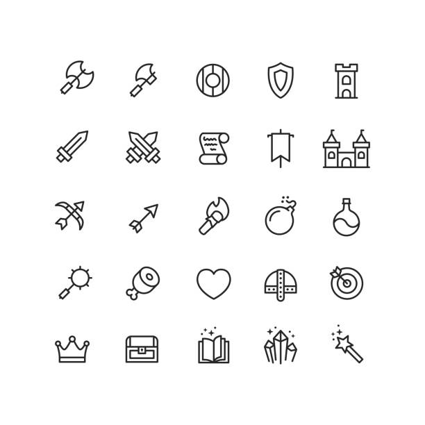
Pixel Art
Pixel art remains the workhorse of indie development. It’s not just about looking retro; it’s about intentional limitation. Every pixel counts, which forces clear silhouettes and readable animations. This style is forgiving on performance and easy to animate if you have a clear grid system. It works best for platformers, RPGs, and top-down adventures where clarity is king.
Hand-Drawn
Hand-drawn sprites bring a unique, organic feel that algorithms struggle to replicate. These packs often feature slight imperfections, textured brushes, and fluid motion that feels alive. They are ideal for narrative-driven games or stylized adventures where atmosphere matters more than precise hitboxes. The trade-off is higher production time per frame, so limit the number of unique assets you need.
Vector
Vector sprite packs are built for scalability. They look crisp on any screen size, from mobile phones to 4K monitors. This style is perfect for minimalist designs, puzzle games, or games with a modern, clean aesthetic. The animations are often smooth and geometric, reducing the need for complex keyframing. If you plan to support multiple resolutions without asset bloat, vector is your safest bet.
Match your style to your team’s strengths and your game’s core loop. A mismatched style can make even the best mechanics feel off. Pick one direction and commit to it early.
Design icons that pop on stores
Your game might be a masterpiece, but if the store icon looks like a blurry thumbnail, players will scroll right past it. In 2026, digital storefronts are more crowded than ever. High-resolution, visually striking icons are no longer just a nice-to-have; they are a critical component of your marketing strategy. A sharp icon stops the scroll and invites the click.
Think of your store icon as a billboard on a highway. You have about two seconds to communicate what the game is about and why it looks fun. If the details are muddy or the colors clash, you lose that potential player. We need to shift from thinking about "small assets" to thinking about "high-impact visuals."
Here is a practical, three-step workflow to design icons that stand out in 2026's competitive landscape. This approach focuses on clarity, contrast, and scalability, ensuring your art looks good whether it’s viewed on a 4K monitor or a mobile phone screen.
Start with the most recognizable element of your game. Is it a sword, a spaceship, or a quirky character? Remove all background noise and secondary details. The goal is instant recognition. If a player can’t identify the main subject in a split second, your icon is too busy. Zoom out until the icon is the size of a postage stamp. If it still reads clearly, you’ve nailed the simplification.
Store backgrounds are often white, dark gray, or dynamic gradients. Your icon needs to pop against these. Use complementary colors to create visual tension. For example, a vibrant orange character against a deep blue background will draw the eye immediately. Avoid pastels or low-contrast palettes that blend into the UI. High saturation and strong contrast signal energy and excitement, which are key triggers for clicks.
Your icon will live on desktop stores, mobile app pages, and social media ads. Design at the highest resolution you can, then test it at 64x64 and 128x128 pixels. Check for jagged edges or lost details. Ensure the focal point remains centered and visible. A sharp, well-optimized icon shows professionalism and care, which builds trust with potential players before they even launch the game.
By following these steps, you turn your icon from a passive asset into an active marketing tool. It’s not just about making something look pretty; it’s about communicating value quickly. In a market where attention is the scarcest resource, a high-res, well-designed icon is your best first impression.
Use AI to speed up asset creation
By 2026, AI has moved from a novelty to a core part of the indie workflow. Instead of spending hours hand-painting every pixel variation for a sprite sheet, you can generate base assets in seconds and refine them in your editor. This shift allows small teams to compete with larger studios on visual quality without burning out on repetitive tasks.
The key is treating AI as a co-pilot, not an autopilot. Start by generating a set of icon variations or background textures. Use these as starting points, then apply your own style guides and color palettes to ensure consistency. This hybrid approach keeps the assets looking hand-crafted while leveraging AI’s speed for iteration.
For a visual walkthrough of this process, watch this demo on using AI tools for game asset generation:
Best premium graphics for 2026
Picking the right assets can save weeks of pixel-pushing. For indie teams, the goal is high-fidelity visuals without the AAA price tag. These packs are built for small workflows, offering modular sprites and scalable icons that fit modern 2026 game design trends.


As an Amazon Associate, we may earn from qualifying purchases.
Check your assets before launch
Before you hit publish, treat your sprite sheets and icon sets like a final proofread. In 2026, players expect crisp visuals that load instantly, so small inconsistencies stand out. A single misaligned pixel or blurry icon can break immersion and hurt your game’s credibility. This quick audit ensures your art holds up under scrutiny.
Use the checklist below to catch common issues before they become player complaints. Focus on technical integrity first, then aesthetic polish. If an asset fails any of these checks, fix it now rather than patching it later.
-
Verify all sprite frames align to the grid without gaps or overlaps
-
Confirm icon resolution matches target display density (DPI/PPI)
-
Test color palettes for contrast accessibility on dark and light modes
-
Check file sizes against memory budget constraints
-
Ensure no embedded metadata or watermarks remain in export
Overlay your final assets against the original source files. Look for compression artifacts or accidental scaling that occurred during export. This step catches subtle quality drops that are hard to see during active development.
Is game design a good career in 2026?
The short answer is yes, but the path has shifted. The industry is no longer just hiring pure artists or pure coders. In 2026, the most sought-after game designers are those who understand the full pipeline—especially those who can create high-quality, optimized assets that work across platforms.
New graduates often face stiff competition. To stand out, you need more than just a degree in art or design. You need proficiency in emerging tools like AI-assisted workflows and cloud-based collaboration. Adaptability is your biggest asset. If you can pivot from pixel art to 3D modeling or learn basic scripting to implement your own assets, you become invaluable to small, efficient teams.
Focus on building a portfolio that shows this versatility. Show how you solve problems, not just how you draw pretty sprites. The market rewards those who can deliver polished visuals quickly and efficiently.
No comments yet. Be the first to share your thoughts!