
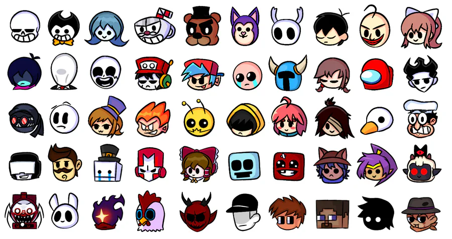
Pick a clear visual style
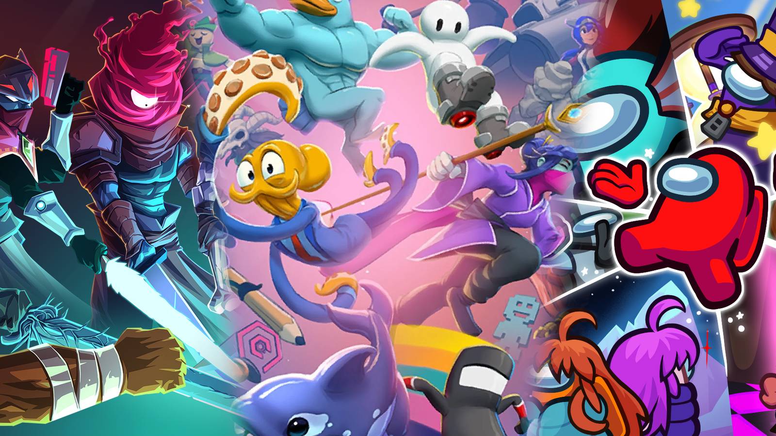
Your indie game icons need to tell a story before the player even clicks "Start." In a crowded marketplace, consistency is what keeps your game recognizable. If your main menu uses sharp, flat vectors but your inventory icons are messy hand-drawings, you break the player's immersion. Choose one aesthetic direction—pixel, flat, or hand-drawn—and stick to it across every asset in your UI.
Pixel art is a classic choice for retro-inspired titles. It works best when you limit your palette and use aliasing intentionally. Think of it as building with digital LEGOs; every square counts. If your icons are too detailed, they become muddy at small sizes. A simple sword or potion bottle should be readable at 32x32 pixels.
Flat design offers a modern, clean look that scales well across different screen resolutions. The trick here is using bold shapes and limited gradients. Avoid subtle shadows or complex textures. Instead, rely on strong silhouettes and high-contrast colors to make your indie game icons pop. A bright red apple against a dark background will always stand out more than a realistic, shaded fruit.
Hand-drawn styles add personality and warmth, perfect for cozy or narrative-driven games. However, they are the hardest to keep consistent. Create a strict brush or line weight rule. If one icon has a rough, sketchy edge, all of them should. This uniformity signals quality, even if the art style feels "messy." Remember, the icon is the first impression. Make it count.
Draft your icon composition
Before you commit to pixels or vector paths, you need a clear plan. Most indie game icons fail because they try to do too much. Your goal right now is simplicity. You want a shape that reads instantly, even at 32x32 pixels. Think of your icon as a visual shorthand for the entire game. If the player can't guess what it is in a glance, the composition is too crowded.
Start with rough sketches. Don't worry about details yet. Just block out the main silhouette. Ask yourself: "If I shrink this down to a thumbnail, what is the one thing I see?" For a pixel art sword, that might be the crossguard. For a flat-style potion, it's the distinct bottle shape. Keep the background transparent or solid to isolate the subject.
Grab a pen and paper or open a blank canvas. Draw 5-10 variations of your icon. Focus on the overall shape, not the textures. A simple circle, square, or triangle can often communicate the idea better than a detailed drawing. This is about finding the strongest visual hook.
Once you pick a direction, clean up the lines. Ensure there is enough contrast between the subject and the background. Dark objects need light backgrounds, and vice versa. This is especially critical for flat design styles where shading is minimal. Your icon needs to pop against store backgrounds, which are often white or light gray.
Shrink your design to 16x16 or 32x32 pixels. Zoom in. Can you still tell what it is? If details are blurring together, simplify further. Remove unnecessary lines or colors. The best indie game icons remain recognizable even when they are tiny. This step separates good icons from great ones.
A common mistake is adding too much context. If your icon is for a "health potion," show the potion bottle, not a hero drinking it. The object itself should be the focus. This keeps the composition clean and allows the icon to function as a universal symbol within your game's UI. Keep it tight, keep it simple, and always test at small sizes.
Apply color and detail
Your indie game icons need to pop on a crowded app store or itch.io page, but adding color and detail is where most designers trip up. It’s easy to think that more pixels or gradients equal better quality. They don’t. They equal clutter. The goal here is to add depth and personality without breaking the small, square format your icon lives in.
Think of your icon like a postage stamp. You have very little space to communicate the entire vibe of your game. If you fill every corner with intricate details, the viewer’s eye has nowhere to rest. Instead, use color to guide attention and limit your details to the focal point. This approach keeps your design readable even when it shrinks down to 16x16 pixels on a mobile screen.
Let’s look at how different styles handle this balance. The table below compares two common approaches for indie game icons so you can decide which fits your aesthetic best.
| Style | Pros | Cons | Best For |
|---|---|---|---|
| Flat Color | Crisp at small sizes; easy to read; quick to produce | Can look generic if not paired with strong shapes; limited depth | Pixel art and minimalist flat designs |
| Shaded 3D | High visual impact; feels premium; stands out in grids | Complex to render; loses detail when scaled down | Hand-drawn or stylized 3D aesthetics |
Pick a palette that tells a story
Don’t just pick colors because they look nice together. Pick them because they fit the genre. A horror game icon should feel oppressive, using dark purples, blacks, and sickly greens. A cozy farming sim should feel warm, using oranges, browns, and soft yellows. This is where color theory meets marketing.
Stick to a limited palette. Three to four main colors are usually enough for an indie game icon. Use a bright accent color for the focal point—maybe the character’s eyes or a key item—to draw the eye immediately. This creates a visual hierarchy that helps players understand what your game is about in a split second.
Add detail only where it counts
When you’re designing indie game icons, resist the urge to fill every pixel. Instead, identify the one element that defines your game. Is it the protagonist’s weapon? The mysterious creature in the background? Focus your shading and texture work on that single element.
Keep the background simple. A solid color, a subtle gradient, or a very faint pattern is often enough. If you add too much detail to the background, it will compete with your focal point and make the icon look messy. Remember, your icon needs to be recognizable at 32x32 pixels. If you can’t see the main character or object when it’s tiny, you’ve added too much.
Test at small sizes
Before you finalize your design, zoom out. Look at your icon at 16x16, 32x32, and 64x64 pixels. Does it still read clearly? Do the colors blend into a muddy brown? If so, simplify. Remove unnecessary details, increase contrast between your main subject and the background, and ensure your accent color still pops.
This step is non-negotiable. Many indie developers design their icons at full resolution and only realize too late that the details disappear when the icon shrinks. By testing early and often, you ensure your indie game icons look sharp and professional, no matter where they appear.
Export for digital marketplaces
Your indie game icons look great in your editor, but marketplaces are picky about how they receive files. If you upload the wrong format or size, your icon might look blurry or get rejected entirely. You need to export your designs specifically for platforms like itch.io and Amazon, which have strict technical requirements.
The File Formats You Need
Most digital storefronts prefer PNG for raster graphics and SVG for vector art. If you’re working with pixel art, stick to PNG. It preserves the sharp, blocky aesthetic without introducing compression artifacts that can ruin the look of small icons. For flat or hand-drawn styles, SVG is often better because it scales cleanly without losing quality.
Save your pixel art or raster icons as PNG-24. This format supports transparency, which is essential for icons that need to sit on various background colors. Avoid JPEG; it compresses details and creates a muddy look around the edges of your art. Make sure your canvas is exactly the size required by the platform, usually 512x512 pixels or 1024x1024 pixels for main store pages.

If your icon is vector-based, export it as an SVG. Clean up your paths and remove any unnecessary nodes before saving. Many indie game icons use simple shapes and lines, so a clean SVG file will load faster and look crisp on high-resolution displays. Check that all text is converted to outlines so it doesn’t break if the viewer doesn’t have your specific font installed.
Platform-Specific Sizes
itch.io is very flexible, but it looks best when you provide a square image. A 512x512 PNG is the sweet spot for most game pages. Amazon, on the other hand, often requires higher resolution assets for their storefronts. Always check the specific guidelines for the platform you’re using, as they can change.
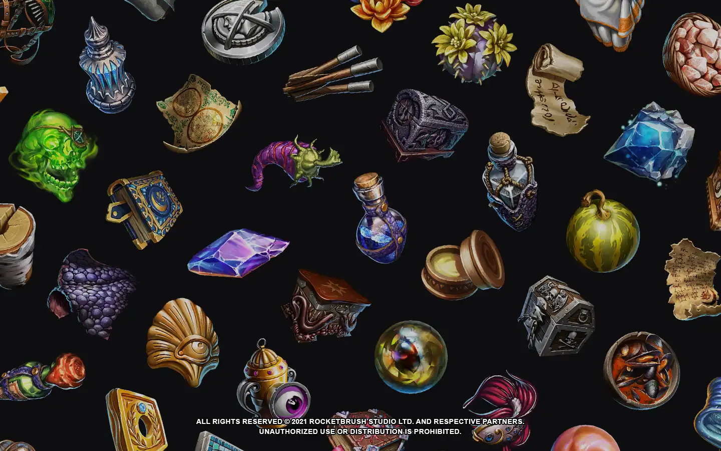
Showcase your icon pack
Your indie game icons are finished, but the presentation is what actually sells them. Think of your listing like a storefront window; if it’s cluttered or dark, no one stops to look. You need to show exactly how these assets fit into a real game environment. Buyers want to see their own projects reflected in your mockups.
Build realistic mockups
Don’t just display the icons on a white background. Place them on a UI mockup that matches the aesthetic of your target audience. If you made flat, minimalist icons, show them on a clean, modern dashboard. If you designed pixel art icons, put them inside a retro-style RPG inventory screen. This visual context helps buyers imagine the final product immediately.
Use tools like Figma or Photoshop to create these scenes. You can find free UI kits online to speed up the process. The goal is to show scale, clarity, and how the icons interact with text and buttons. A pixel art icon might look small and lost on a high-res background, so demonstrate it in a context where its style shines.
Organize for clarity
When a buyer lands on your page, they should understand the pack’s contents in seconds. Use a clear visual hierarchy in your listing images. Start with a hero image that shows the entire pack in use, then break down individual icons in subsequent images. Include a close-up view to show detail, especially for hand-drawn or complex pixel art.
Group similar icons together. If you have a large pack, categorize them by type (e.g., weapons, potions, UI elements) in your preview images. This reduces cognitive load for the buyer. A chaotic gallery suggests a chaotic asset pack. A structured gallery suggests professionalism and ease of use.
Choose the right tools
To get your indie game icons in front of buyers, you need the right distribution channels and supporting tools. Here are some popular resources for inspiration and asset management:


As an Amazon Associate, we may earn from qualifying purchases.
By combining strong mockups with a clear, organized presentation, you turn a simple asset pack into a compelling product. Make it easy for developers to say yes.
Common indie game icon design mistakes
Even polished indie game icons can flop if they stumble on basic visual clarity. Players scan store pages in seconds, so any ambiguity kills the click. Below are the most frequent errors and how to fix them.
Overcrowding the frame Clutter is the enemy of recognition. A common mistake is cramming the title, a complex character, and background scenery into a single square. Your icon needs one focal point. If you are making pixel art, keep the sprite tight. If you are using flat design, remove decorative elements that don’t serve the core concept. The icon should show the object or character in full, with nothing else distracting from it.
Ignoring the thumbnail context Designers often work on large monitors and forget how small the icon will look on mobile. A detailed hand-drawn sketch might look beautiful at 512x512 pixels, but it turns into a muddy gray blob at 128x128. Test your design at actual store thumbnail sizes. If players can’t tell what the game is about from a tiny preview, simplify the shapes and boost the contrast.
Mismatching style with genre A whimsical, hand-drawn icon might work for a cozy puzzle game, but it will confuse players looking for a gritty survival horror title. Your visual style must signal the genre immediately. Use concrete, recognizable symbols that align with player expectations for that niche. When in doubt, look at top-performing indie game icons in your category and ensure yours stands out without breaking genre conventions.
Frequently asked: what to check next
Here are some practical answers to common questions about indie game icons.
No comments yet. Be the first to share your thoughts!