
Pick the right icon style first
Before downloading a single asset, decide on a visual language that fits your game. Your UI icons need to sit comfortably alongside your character sprites and environment art. If your game is a gritty, hand-drawn RPG, a glossy, neon-drenched flat icon set will clash with the aesthetic. Consistency here is what separates a polished indie title from a prototype.
Think of your icon set as the punctuation of your user interface. It shouldn't shout for attention; it should guide the eye. Start by defining three core attributes: stroke width, corner radius, and color palette. A 2px stroke with sharp corners suggests precision and sci-fi themes, while 4px strokes with rounded corners feel approachable and casual. Lock these rules down before you search for game icons, or you will spend hours trying to force mismatched assets to work.
Once you have a style direction, filter your search accordingly. Sites like Game-Icons.net offer extensive collections categorized by style, making it easier to find assets that match your specific vibe. Avoid mixing styles from different packs unless you are deliberately building a collage. A unified set reduces cognitive load for your players, allowing them to recognize actions and items instantly without relearning the interface as they move through different screens.
Search free icon repositories
Finding the right visual assets starts with knowing where to look. Several dedicated platforms host thousands of free icons tailored for indie game development. These repositories differ in licensing, file formats, and artistic style, so selecting the right one depends on your project’s specific needs.
Top free icon sites
The following platforms are reliable sources for high-quality game assets. Each offers distinct advantages regarding format flexibility and licensing clarity.
Top free icon sites
-
Flaticon
Massive library of 163,000+ gaming icons in SVG, PNG, and EPS. Requires attribution for free users unless you subscribe. Great for broad symbol searches. -
Game-icons.net
Curated collection of 4,180 free SVG and PNG icons. All assets are public domain (CC0), meaning no attribution is required. Ideal for retro or consistent art styles. -
Icons8
Offers games icons in 50+ UI design styles, including animated options. Free downloads require attribution. Useful for finding icons that match specific UI themes.
When downloading, always verify the license type. Public domain (CC0) assets allow commercial use without attribution, while Creative Commons (CC-BY) usually requires crediting the author. Check file formats carefully; SVGs are scalable and ideal for UI elements, while PNGs are better for raster-based sprites.
Evaluate premium sprite packs
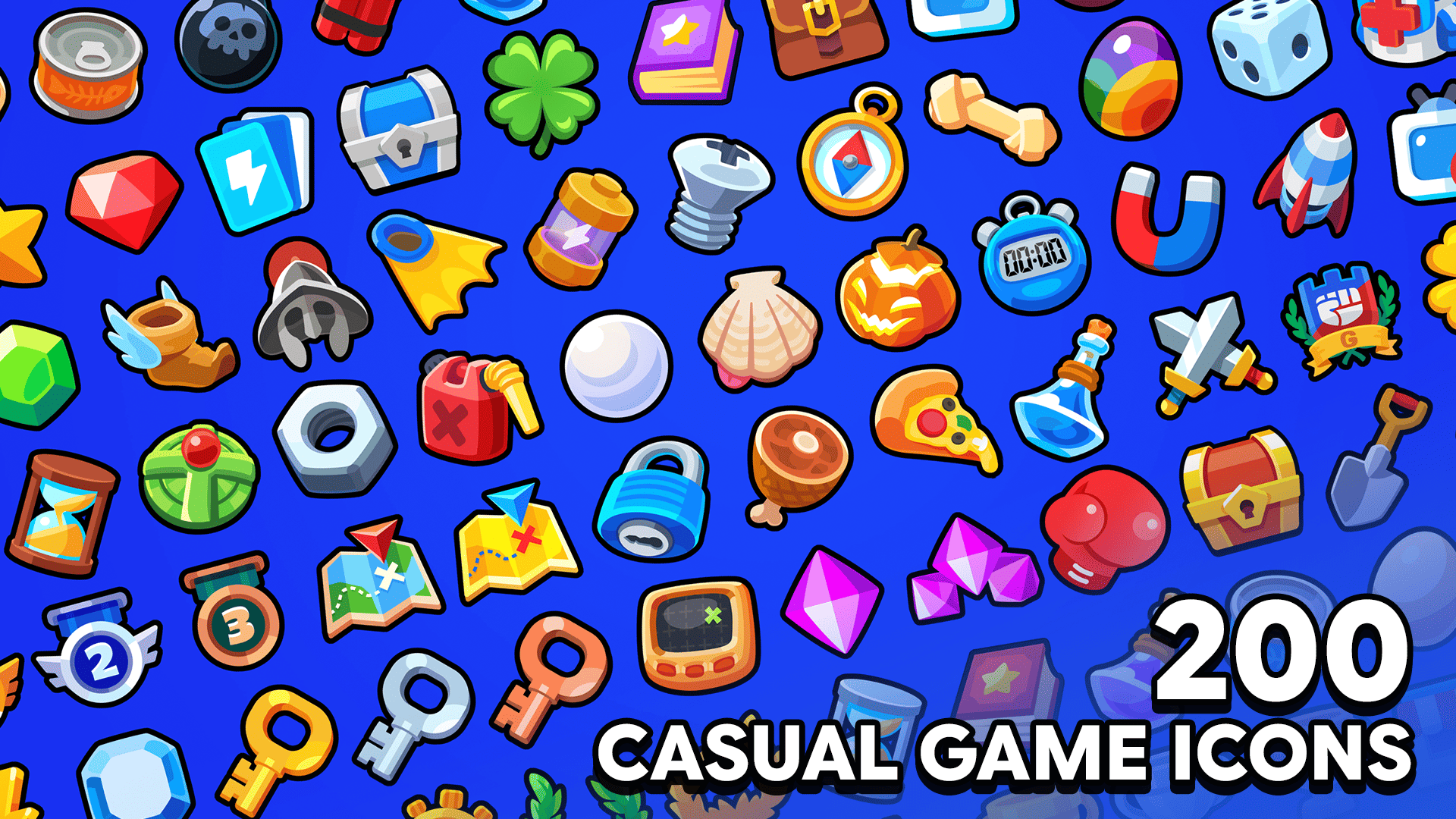
Buying premium game icons is often the fastest way to secure a polished look for your indie project without hiring a full-time artist. While free assets are plentiful, they come with trade-offs in uniqueness, support, and licensing clarity. Premium packs from reputable marketplaces like CraftPix or Unity Asset Store typically offer higher resolution, consistent art direction, and clear commercial rights.
Free vs. Premium Game Icons
When deciding between free and paid assets, consider the long-term impact on your brand. Free icons are often used by hundreds of other developers, making it harder to distinguish your game. Premium packs provide exclusive or limited-use licenses, ensuring your visual identity remains unique. They also usually include source files, allowing you to tweak colors or shapes to fit your specific UI needs.
What to look for in a bundle
Before purchasing, verify the license terms carefully. Ensure the pack allows for commercial use in games you intend to sell. Check if the license covers multiple platforms (PC, mobile, console) and if there are any revenue caps. Additionally, look for packs that offer regular updates or bug fixes, as this indicates active maintenance by the creator.

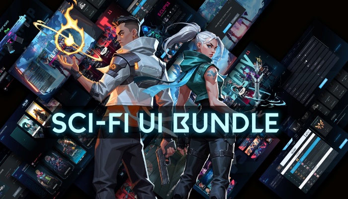
- Futuristic design elements
- Includes HUD components
- Vector source files
As an Amazon Associate, we may earn from qualifying purchases.
Download and organize your assets
A disorganized folder structure is the fastest way to lose track of your game icon downloads. Treat your asset library like a warehouse: if you don't label the boxes and stack them correctly, you will waste hours hunting for a single PNG file later. This workflow ensures your icons are not just saved, but ready for immediate integration into your game engine.
Before downloading a single file, set up your project directory. Create a root folder named assets and inside it, make a subfolder called icons. Within icons, create separate folders for each resolution you plan to use, such as 16x16, 32x32, 64x64, and 128x128. This hierarchy mirrors how most game engines expect to find sprite sheets or individual icons, preventing path errors during implementation.
Most icon repositories like Flaticon or Game-icons.net offer multiple formats. For game development, prioritize PNG for pixel art or flat designs, and SVG for vector-based icons that need scaling. Avoid downloading JPEGs, as they introduce compression artifacts that ruin sharp edges. Select the resolution that matches your target folder (e.g., download the 32x32 version into your 32x32 folder) to avoid unnecessary upscaling or downscaling in your engine.
Never leave a file named icon_12345.png. Rename every icon immediately after download using a descriptive, lowercase convention. Use underscores to separate the category from the specific item, such as weapon_sword.png or ui_button_pause.png. This naming convention makes it easy to search for assets programmatically or within your engine’s file browser, saving significant time during coding and UI layout.
Before finalizing your download, open the file in an image editor to check for stray pixels or unwanted white backgrounds. If an icon has a white background where it should be transparent, use a color key or eraser tool to clean it up. Ensuring clean edges at this stage prevents visual glitches when the icon is placed over various background colors in your game.
By following this disciplined approach, you turn a chaotic pile of downloads into a structured library. This preparation pays off immediately when you start dragging and dropping icons into your engine, allowing you to focus on gameplay mechanics rather than file management.
Check licensing before you use
Before you drop a game icon into your project, you need to know exactly what rights you have. "Free" rarely means "do whatever you want." Most assets fall into one of two buckets: free with attribution or paid commercial licenses. Mixing these up is the fastest way to get a cease-and-desist letter.
Free assets with attribution
Many sites like Game-icons.net or Flaticon offer icons for free, but they usually require you to credit the artist. This might look like a simple line in your game's credits or an "About" screen. If you ignore the attribution requirement, you are infringing on copyright, even if you didn't pay for the icon. Always copy the exact attribution text provided by the creator and paste it into your game.
Paid commercial licenses
If you want to skip the credits and use icons in a commercial release, you typically need to buy a license. These licenses grant you the right to use the asset in a product you sell. They vary widely—some cover one project, while others cover unlimited projects. Read the fine print to ensure your specific use case (e.g., mobile app vs. desktop game) is covered.
Verify before you ship
Don't wait until launch day to check your assets. Create a simple checklist for every icon in your project. Verify the license type, confirm the attribution text is correct, and ensure the asset integrity hasn't been compromised by editing. This small step protects your indie project from legal headaches later.
Common icon mistakes to avoid
Even with a polished art style, mismatched icons can break the visual language of your indie game. Players rely on these symbols for instant recognition; when they clash or confuse, it creates friction that pulls them out of the experience. Avoiding these common pitfalls ensures your UI remains intuitive and professional.
Mixing visual styles
The most frequent error is combining assets from different sources without a unifying filter. One icon might be flat and minimalist, while another uses heavy gradients and shadows. This inconsistency makes the interface look assembled rather than designed. Always pick a single art direction—such as outlined, filled, or pixelated—and stick to it for every single button and status indicator.
Ignoring resolution and scaling
Game icons must scale cleanly across different screen sizes and densities. Downloading low-resolution PNGs that look crisp on a desktop monitor will appear blurry or pixelated on mobile devices or high-DPI screens. Always prioritize SVG formats for vector clarity, or ensure your PNGs are provided in multiple resolutions (1x, 2x, 3x) to maintain sharpness on all displays.
Overloading the UI
Indie developers often feel the need to fill every corner of the screen with decorative symbols. This visual noise distracts from the core gameplay and makes important information harder to spot. Treat icons as functional tools, not decorations. If an icon doesn’t convey immediate meaning or utility, remove it. Less is almost always more in UI design.
Neglecting accessibility
Color is not a reliable indicator of status. Relying solely on red for damage or green for health excludes players with color blindness. Always pair color cues with distinct shapes or patterns. For example, a skull icon for damage and a shield for health provide clear context regardless of the player’s visual capabilities.
No comments yet. Be the first to share your thoughts!